

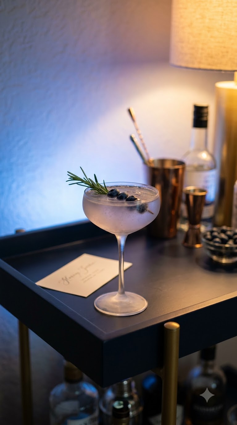
Dark blue has a strange kind of authority. Hang it in a room with hotel-lobby gold hardware and it reads formal. Pair it with brass candle holders and blush peonies and it goes warm without losing its edge. That’s the appeal of dark blue birthday theme ideas: the color does half the styling work before you’ve hung a single balloon. Most navy party boards on Pinterest lean one of two ways, either flat and corporate or so dark the photos come out muddy. Neither has to be your outcome. The trick is contrast: metallics that catch light, a second and third shade of blue so the room doesn’t read as one block, and texture that keeps navy from looking like a paint swatch instead of a party. Below are nineteen specific ways to pull a deep blue palette together for an adult birthday that photographs well and doesn’t feel like it came out of a box. Some are small touches you can add to a table you already have. Others reshape the whole room. Pick the ones that fit your space and your guest list, and layer from there.
Layer Three Shades of Blue Instead of One Flat Navy
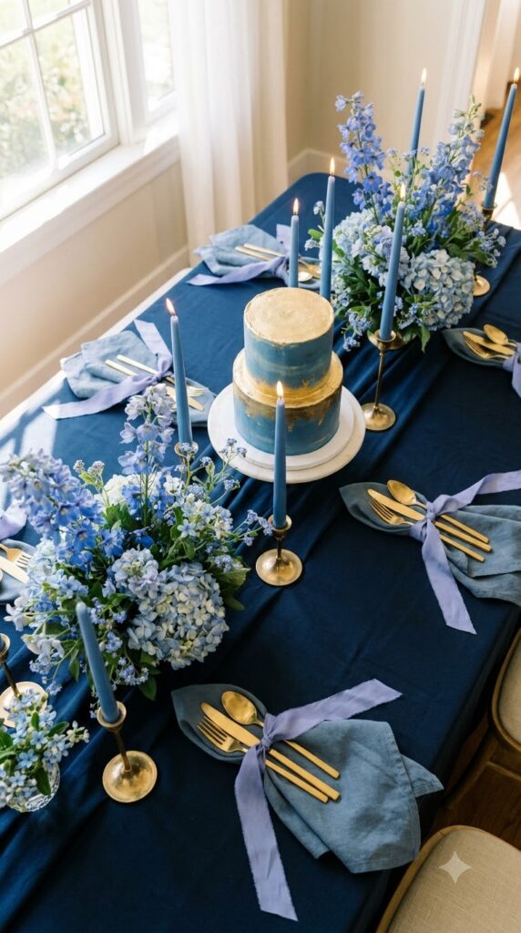
A single shade of navy across tablecloth, napkins, and balloons goes flat in photos, even when it looks rich in person. The fix is layering: a deep midnight base, a dusty slate blue for napkins, and a periwinkle accent in the flowers or ribbon. Set them next to each other and the eye reads depth instead of one dark block. Add one metallic to break up the blues entirely, gold if you want warmth, silver if you want the look to stay cool. Here’s a fast reference for pairings that hold up in photos.
Build a Balloon Garland That Avoids the One Note Look
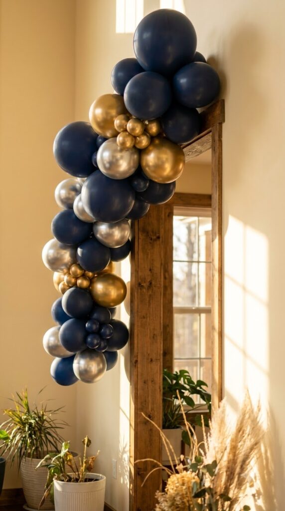
Start with a balloon strip or garland tape as your base, then work in three sizes, not two. Big 18 inch balloons anchor the shape, mid-size 11 inch balloons fill gaps, and small 5 inch balloons tuck into the spots that always show up empty. Mix matte navy with a few chrome silver or gold balloons instead of using metallics only as an outline. Leave a handful of spots ungarlanded on purpose. A cluster with breathing room around it reads more expensive than one packed edge to edge.
What to grab first
One Velvet Runner Changes the Whole Table
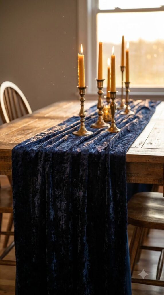
Rule of thumb: texture reads before color does. A flat navy tablecloth photographs like a bedsheet. A velvet runner down the center, even a narrow one, catches light differently at every angle and makes the whole table look considered instead of rented. You don’t need to cover the full table in velvet. Run it down the middle over a plain linen or a wood table, and let the contrast between the flat base and the textured runner do the work. It’s the cheapest upgrade on this list.
💡 Quick Tip
Buy velvet ribbon by the yard instead of a runner if you’re on a tight budget. Layer two or three widths down the center for the same textured look at a fraction of the cost.
Dark Blue and Blush Isn’t a Mismatch, It’s the Move
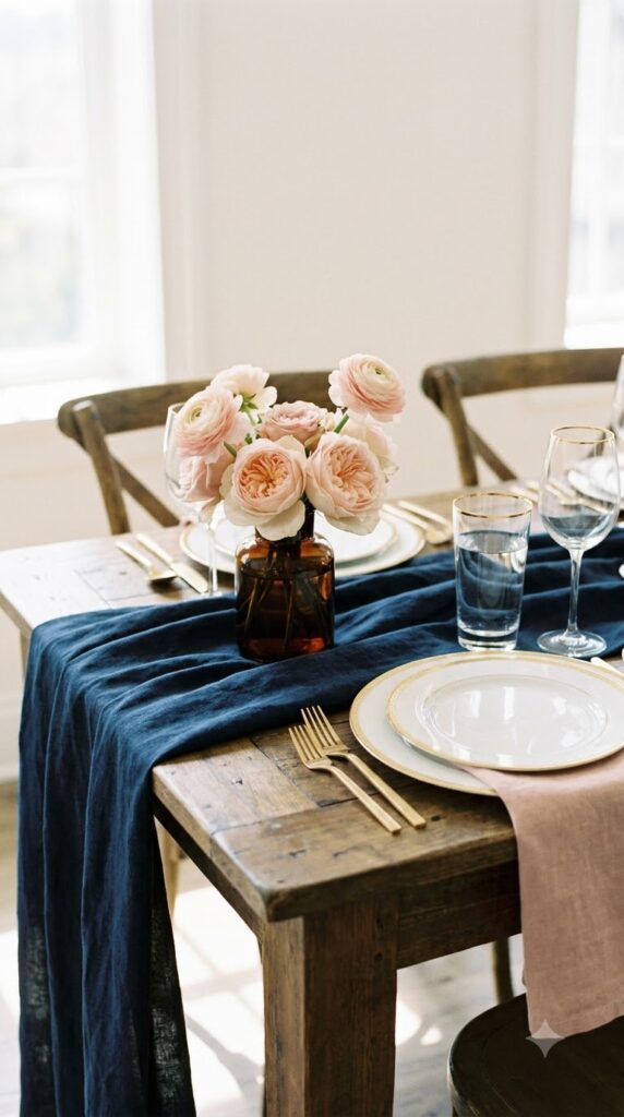
People assume navy needs to stay cool, all silver and white and ice. That’s one option, not the rule. Blush and dusty rose against a deep blue base soften the whole palette without turning it pastel. The blue keeps the look grounded so the pink never tips into a baby shower. Use blush sparingly, in the florals or a ribbon, not the linens, so navy still reads as the dominant color. Guests notice the unexpected pairing before they notice anything else on the table.
Use blush in small doses, florals, ribbon, place cards.
Let navy stay the dominant color throughout.
Swapping the tablecloth itself to blush.
Using blush and navy in equal amounts.
Skip Printed Place Cards for a Wax Seal Escort Wall
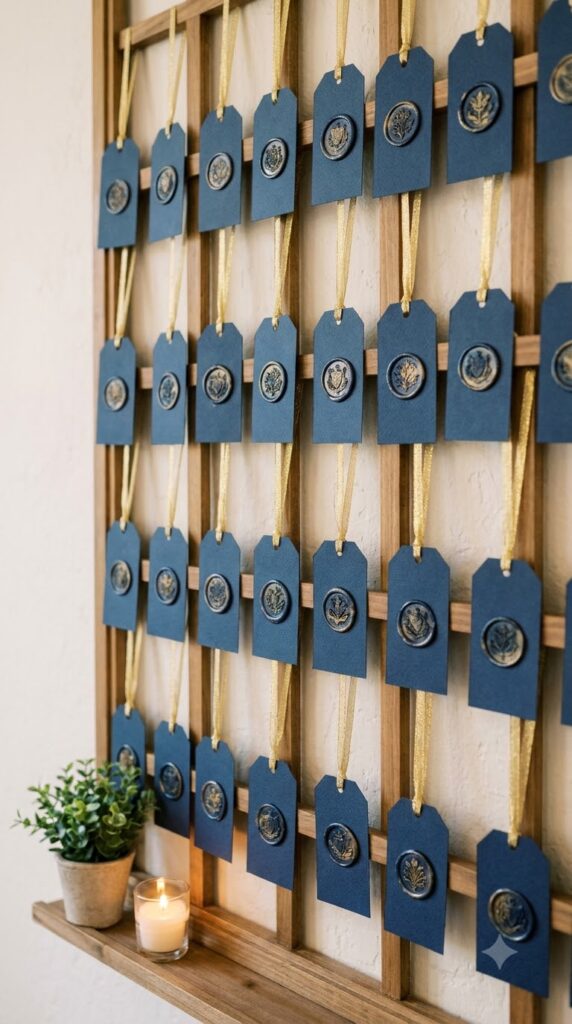
An escort wall does two jobs a table card can’t: it gives guests something to gather around before they sit, and it photographs like a design feature instead of a logistics tool. Hang navy cardstock tags from ribbon on a simple frame or wall grid, then close each one with a wax seal in gold or silver. It takes an evening to assemble but looks like it came from a stationer. Guests peel their tag off and carry it to their seat, so the wall doubles as decor for the whole party, not just the first ten minutes.
Cut navy cardstock tags and punch a hole in each
Write names in gold or silver ink
Thread ribbon and hang from a frame or grid
Press a wax seal below each name
Silver Flatware vs Gold, Which One Actually Fits Your Blue
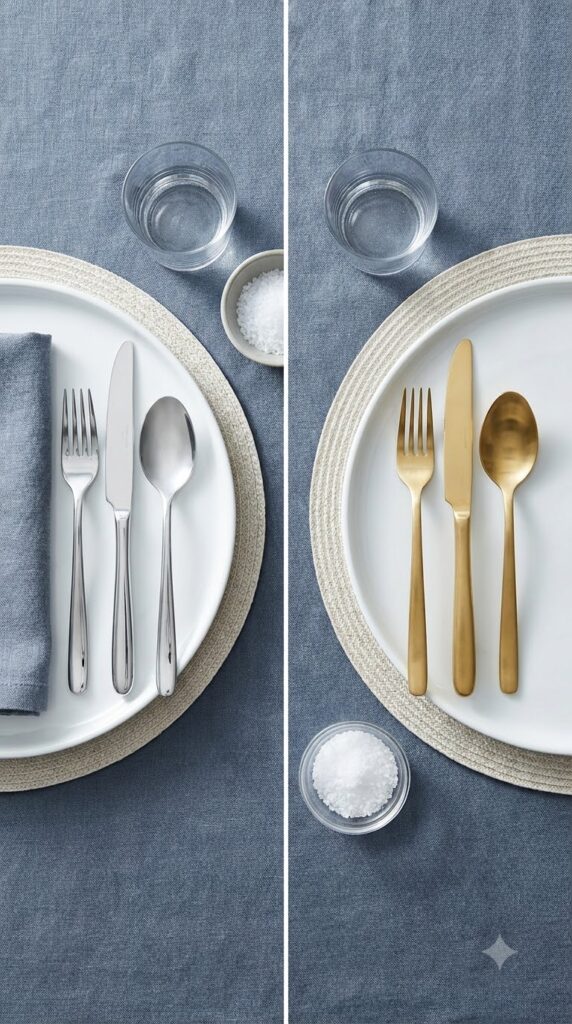
Gold gets recommended by default, but it’s not always the better match. If your blue leans warm, closer to a true navy with a hint of black, gold flatware and gold-rimmed glassware pull it toward classic and formal. If your blue leans cool, more of a slate or steel undertone, silver keeps the whole table in one temperature instead of fighting the linens. Neither is more elegant than the other. The mistake is picking whichever metal you already own without checking it against your actual fabric swatch first.
A Plain Wall Kills Good Lighting Before It Starts
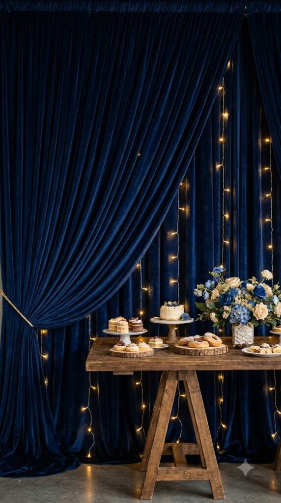
Even a well-styled table looks amateur in photos if the wall behind it is beige or covered in something nobody planned for. A dark blue backdrop, whether it’s fabric, a painted foam board, or draped velvet curtains, absorbs the flash instead of bouncing it back flat, so the people in front of it look lit on purpose. This matters most for the cake table and the photo corner, the two spots every guest ends up in front of with a phone. You don’t need a professional setup, just one clean panel of navy behind the areas people actually gather.
📌 Good To Know
Command hooks and a length of navy fabric from a craft store cost less than a rental backdrop and take about ten minutes to hang.
Matching Every Candle Height Looks Staged, Not Styled
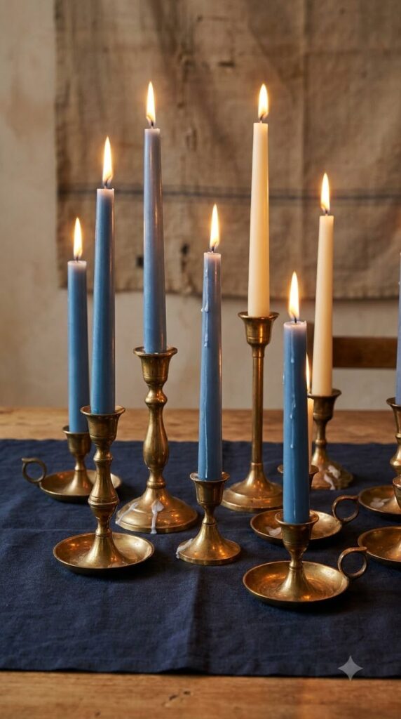
The instinct is to line up identical taper candles in a row because it feels neat. It actually reads flatter than mismatched heights do. Pull three or four candlesticks in different sizes, gold or brass if you have them, and let the tapers vary in a shade or two of blue and cream. Cluster them instead of spacing them evenly. Uneven groupings catch the eye and photograph with more shadow and depth, which is exactly what a flat row of matching candles can’t do.
| Matching, evenly spaced | Mixed heights, clustered |
|---|---|
| Flat, catalog look | Depth and shadow in photos |
| Feels like a rental setup | Feels collected over time |
White Florals Against Navy Make the Arrangement Do Less Work
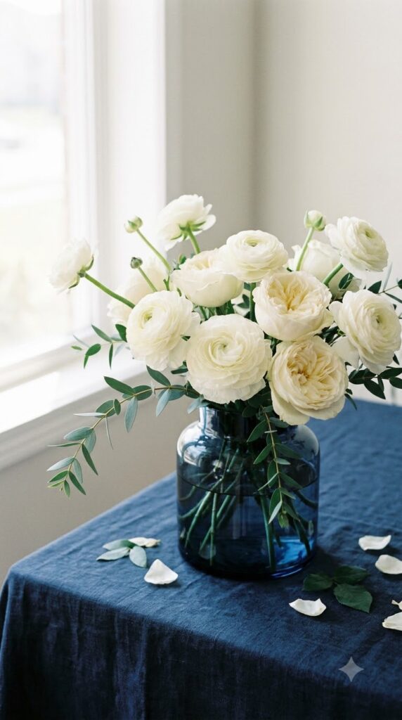
Set a bouquet of deep blue hydrangeas on a navy tablecloth and it disappears into the fabric by the third photo of the night. Swap in white ranunculus, garden roses, or simple carnations against the same navy base and the flowers suddenly read as the focal point instead of blending in. You don’t need an elaborate arrangement. A loose cluster of white blooms in a dark glass vase, with a few sprigs of eucalyptus for texture, does more visual work on a navy table than a full floral centerpiece in matching blues ever will.
Blue florals on blue linen, flat and hard to photograph.
White blooms on the same linen, instant contrast.
A Named Cocktail Turns Navy Into the Whole Night’s Theme
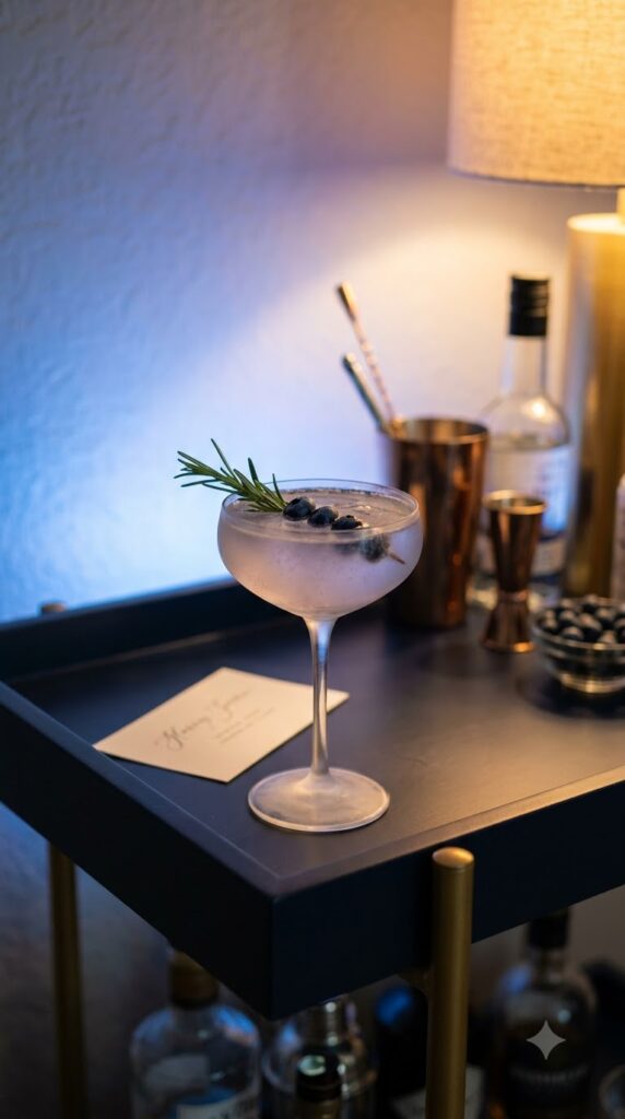
The detail people remember longest isn’t usually the tablecloth, it’s the drink with their friend’s name on a little card by the bar. A signature cocktail in a blue-adjacent color, a blueberry gin fizz or a violet-hued spritz, ties the palette to something guests actually interact with instead of just look at. Write the name and a short description on a card in the same gold or silver ink used elsewhere on the table. It costs about the same as offering a full bar and gives the whole party one more thing that feels custom instead of generic.
💡 Quick Tip
Keep one non-alcoholic version of the same drink on the menu, in the same glass, so it doesn’t feel like an afterthought.
Set the Tone on the Invitation Before Anyone Arrives
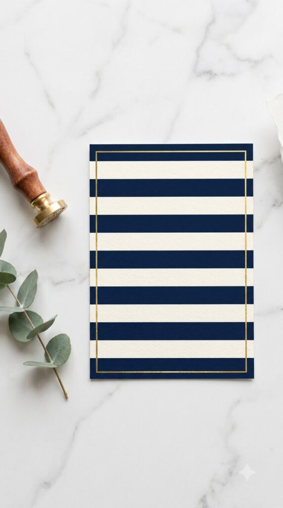
Guests decide how dressed up to show up based on the invitation, so it earns more design attention than most people give it. Print or design invitations in navy and cream stripes, a simple, tailored pattern that reads elegant without needing a single extra graphic. Add a thin gold foil border or gold text for the names and date. Keep the wording short and specific about dress code if you have one, since a striped navy card already signals the party is a step up from casual, and guests will dress accordingly without being told twice.
Confetti Under Glass Looks Intentional, Loose Confetti Doesn’t
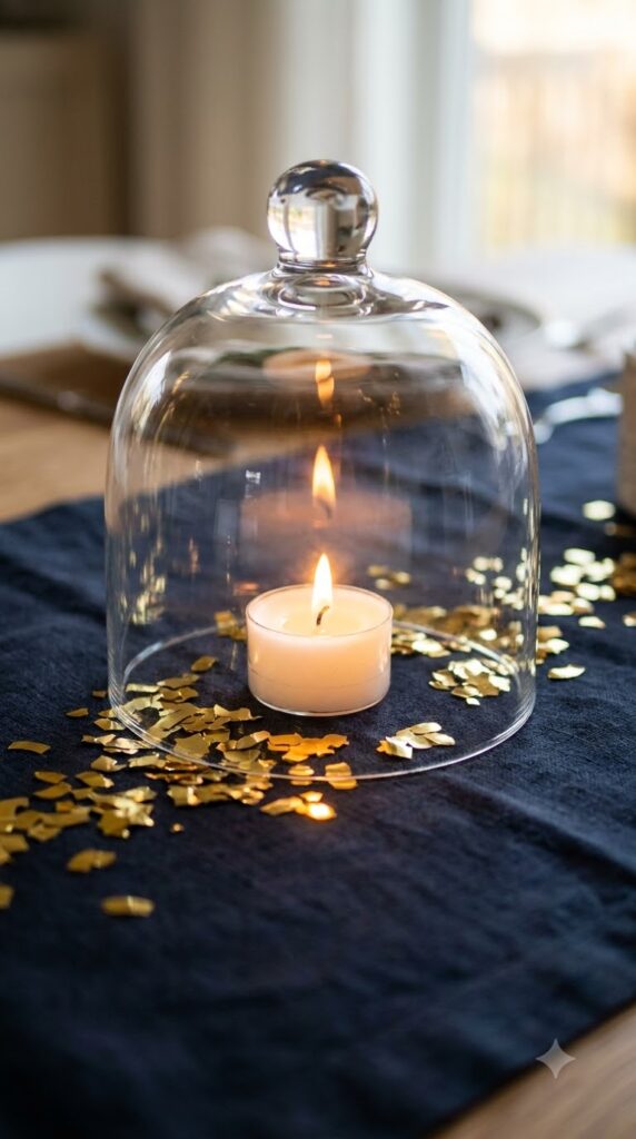
Loose metallic confetti scattered across a table looks great for the first hour and like a mess that needs sweeping by the second. Trap it instead. Scatter a small handful of gold or silver confetti under glass cloches, apothecary jars, or even upturned glasses, with a candle or small object inside. The confetti stays contained, catches candlelight from below, and doesn’t end up stuck to anyone’s dessert plate. It’s a small styling trick that separates a table that looks planned from one that looks like glitter happened to it.
Choose glass cloches or jars in varying sizes
Add a small pillar candle or trinket inside
Scatter confetti at the base before covering
Space across the table instead of clustering
Three Shades of Blue on the Dessert Table Beat an All Navy Spread
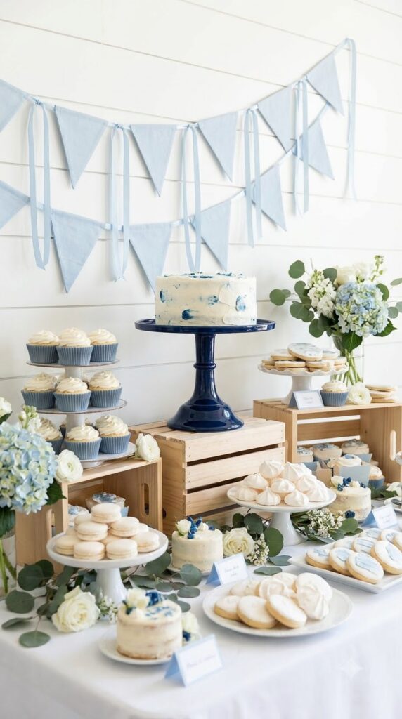
A dessert table where every plate, napkin, and stand is the same navy starts to look like a uniform instead of a display. Vary the blue across three tones, a deep navy stand for the cake, a lighter dusty blue for the cupcake liners, and a pale powder blue for the ribbon or bunting, and the table gains dimension without introducing a new color. Guests can actually see where one dessert ends and the next begins, which matters more than it sounds like when everything is the same family of color.
Stagger heights and shades across the spread.
Use one tone per element, stand, liners, ribbon.
The exact same navy on every single element.
Skipping a lighter shade entirely.
Rental Tables Photograph Flat Until You Add One Detail
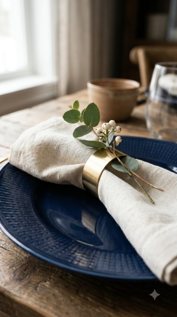
Rented tables come in one shade of white or beige, and no amount of centerpiece work fixes that if the linen underneath looks like a hotel banquet hall. Personalized navy napkin rings, whether monogrammed, tied with ribbon, or tucked with a sprig of greenery, add the one custom detail rental furniture can’t provide on its own. They’re inexpensive per guest and do more to make a table feel styled than a second centerpiece would. Order or make them in the same metallic as your flatware so nothing on the table feels like it’s competing.
What to grab first
Uplighting vs Candlelight, Pick Based on the Room, Not the Trend
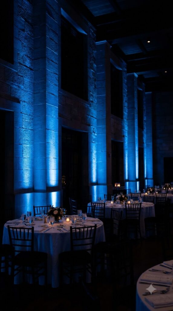
Blue uplighting against a plain wall changes a rented hall or a living room in about the time it takes to plug in the fixtures, and it’s the fastest way to make a space feel like it belongs to the party instead of whatever it was used for last. Candlelight does something uplighting can’t, it warms navy up instead of deepening it, which matters if your room already reads a little cold or corporate. Bigger open rooms usually need the uplighting. Smaller, more intimate setups do better with candles doing the same job.
A Dark Cake Doesn’t Need to Be a Black Cake
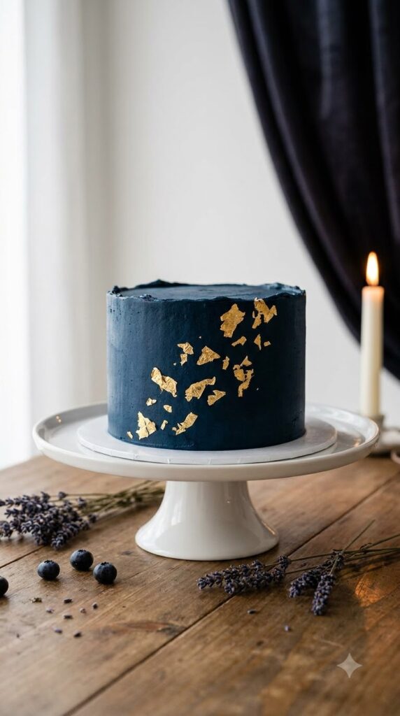
Dark blue cakes get skipped because people assume the food coloring will stain mouths and teeth, or that the color will read as too gothic for a birthday. Midnight blue buttercream, made with a proper navy gel color rather than stacking blue and black, avoids both problems and still reads dramatic against a white dessert table. Add torn gold leaf around the base or scattered across the top, and the cake becomes the centerpiece of the whole spread without needing sugar flowers or a complicated design underneath the color.
💡 Quick Tip
Test your icing color a day ahead. Navy gel needs time to deepen, so it often looks lighter than expected right after mixing.
New Brass Looks Colder Than Navy Needs It To
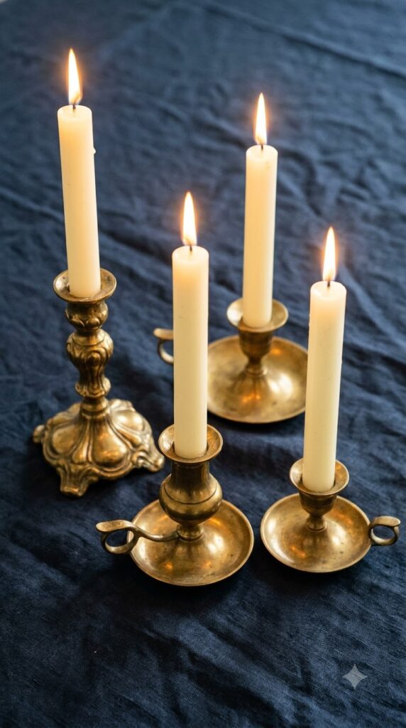
Brand new gold or brass accents, straight from a party supply store, often have a flat, slightly cool shine that fights with a deep blue palette instead of warming it up. Vintage or antiqued brass candle holders, picked up secondhand or from a thrift store, carry a softer patina that actually reads warmer against navy than shiny new pieces do. You don’t need matching sets. Two or three different antique holders mixed with your other metallics look collected rather than purchased for the occasion, which is the exact effect a polished party is going for.
Vintage brass warms navy up more than anything shiny and new ever will.
An Arch Does Double Duty as Doorway and Photo Backdrop
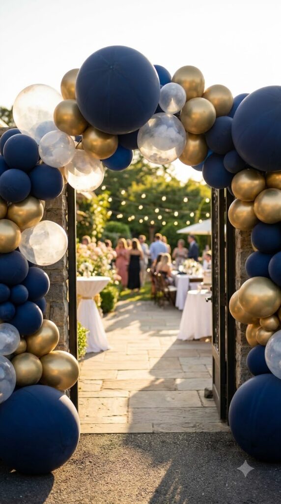
Guests arrive, take a photo at the door, and thirty seconds later that same spot is empty for the rest of the night unless it’s doing something else too. A blue and gold balloon arch built over the entryway solves that: it welcomes people in and then sits there for the rest of the party as the default photo spot, no extra setup required. Build it with a mix of matte navy, chrome gold, and a few translucent balloons so light passes through in places instead of the whole arch reading as one solid block.
| Separate entry and photo setups | One balloon arch, doing both |
|---|---|
| Two setups, two budgets | One setup, one budget |
| Entry decor removed once guests are in | Stays as the photo spot all night |
Printed Menu Cards Make a Casual Dinner Feel Hosted
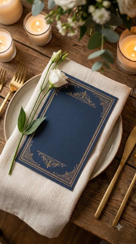
The difference between a dinner party and an event usually comes down to whether someone bothered to write the menu down. A navy card with the courses listed in gold serif type, even for a simple three course meal, tells guests this was planned rather than assembled that afternoon. Set one at each place or a shared one per table. It gives people something to read while they wait between courses, doubles as a keepsake a few guests will actually take home, and costs next to nothing to print once the design is set.
Plates arrive with no context, feels casual.
A printed card sets expectations, feels hosted.
Save These Dark Blue Birthday Theme Ideas for Later
None of these ideas need to happen all at once. A velvet runner and mismatched candles can carry a table on their own. Add the balloon arch and a backdrop when you’re ready for more, and let the dessert table and cake pull double duty as the visual anchor of the room. What ties dark blue birthday theme ideas together isn’t a single trick, it’s contrast: texture against flat fabric, metallics against matte, white against navy. Start small, layer as you go, and let the palette do more of the work than you expect. Save this list for the next time you’re planning a party that needs to look a little more grown up.